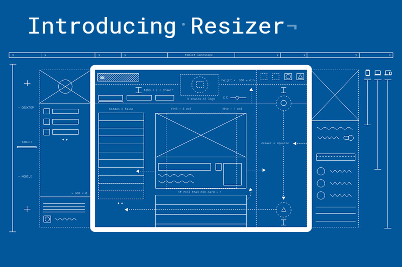
Responsive Design Testing Simplified
From Google’s Press Release:
As designers and developers of digital products, one of our greatest challenges is figuring out how to serve the right UI to our users at the right time. No matter how they’re using an application, be it a phone or through VR, manipulating it with gesture or a mouse, on the latest and greatest tech or a hand-me-down 2G, it is our responsibility to make our products accessible to everyone—and that’s a pretty tall order. There’s no simple design solution to fit every need.
What does this mean to me? I applaud Google for making tools like this and making them freely available as this helps for several reasons:
- Not everyone is using a responsive framework so free tools are good tools
- Even those that are using a responsive framework can benefit from standardization of break points
- The tool can be used for websites, web applications, etc
At this point every website designer who is worth anything is building with responsive design principles. You may not like the bloat of Bootstrap, but maybe you’re not ready to write your own media queries. Regardless, responsive is the way to go and Google Resizer can help you see the good and bad with your designs.
Well.done.Google


Recent Comments